Instagram is testing a feature that will let users pin posts to their profiles
Instagram introduced the chronological feed back last month. The social network has now added another feature to its platform: users can pin posts to their profiles.
Currently, users can pin a story, which can feature a post, but pinning posts directly wasn’t possible. That might change soon as a Meta representative wrote to TechCrunch: “We’re testing a new feature that lets people feature posts on their profile”.
Work on this has been ongoing for a while now, Alessandro Paluzzi dug into the Instagram app and found the option back in January:
The Pin option has been made available to some users. Not all, as the new feature is still in the testing phase. It will be possible to continue sharing new content and promote old posts if/when it is made available to everyone.
Poll: Are you going to use Apple’s new Self Service Repair program?
Apple launched its new Self Service Repair program today, which allows iPhone customers in the United States to access parts and manuals that they can use to repair their own devices – starting with iPhone 12, iPhone 13, and iPhone SE 3. Do you plan to make use of this program?
iPhone owners can now repair parts, such as the battery and camera, using Apple’s Self Service Repair Program. Later this year, the company will also make M1 Mac parts available as well.
The tools and parts that the Self Service Repair Store offers are identical to what Apple’s repair team has access. A complete kit of tools can be rented for a week, priced at $49. These toolkits include the necessary press, screw bits, protective covers, and other materials required to carry out the repair professionally. You can purchase individual tools to save.
As 9to5Mac explained earlier today, the pricing of parts varies, depending on the repair and device type. For example, an iPhone 13 Pro display repair bundle is priced at $269. A battery bundle is $71. For context, you can actually get your iPhone battery serviced through Apple for slightly less money – only $69. An Apple screen replacement service for an iPhone 13 costs $279, only $10 more than the Self Service cost.
iFixit also praised Apple Self Service Repair program, although the company thinks it falls short of Right to Repair goals as independent shops can’t purchase key parts without an iPhone serial number or IMEI.
The biggest problem? Apple has increased the number of parts-paired strategies, which means that only a few serial numbers can be used for authorized repairs. You cannot purchase key parts without a serial number or IMEI. If you use an aftermarket part, there’s an “unable to verify” warning waiting for you. This tactic impedes third-party repairs with scare tactics, feature loss, and can limit the options available to recyclers or refurbishers. It could also shorten the cycle of economic growth.
In addition, Apple also makes sure to warn customers that if they wrongly repair their iPhones, AppleCare won’t cover the new issue.
With all that in mind, are you planning to use the new Self Service Repair program? Vote in the poll and share your thoughts in the comments section.
Sponsored by FitnessView: A health and fitness dashboard for tracking Health data with insights, widgets, and Apple Watch support!
New episodes of 9to5Mac Daily are recorded every weekday. Subscribe to our podcast in iTunes/Apple Podcast or your favorite podcast player to guarantee new episodes are delivered as soon as they’re available.
Stories discussed in this episode:
Apple Self Service Repair store now available, allowing customers to repair their own iPhones for the first time
Studio Display webcam fix: How to get Apple’s update early
Apple releases Studio Display Firmware 15. 5 beta for developers, webcam fixes included
New Apple Card promotion offers $75 Daily Cash bonus for new referrals
Netflix will expand its Games catalog to up to 50 titles by the end of this year
Last year Netflix launched the Games service, which allows subscribers of the streaming giant to download and play select Android and iOS games for free. 17 titles are available at the moment, but The Washington Post reports that the company aims to grow that list to nearly 50 games.
To be clear, we’re talking about games that run on your device, you just don’t have to buy them (similar to Apple Arcade) and there are no ads or in-app purchases. This isn’t a game streaming service like GeForce Now or Google Stadia.
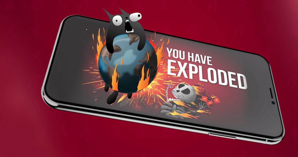
It looks like the company is going to leverage vertical integration. The company is currently developing a mobile and TV game based on the Exploding Cats boardgame. The mobile game is launching next month, the TV show is slated to premiere in 2023.
Netflix already has multiple shows based on games in its streaming catalog: The Witcher, Arcane (based on League of Legends), The Cuphead Show, DOTA: Dragon’s Blood, Castlevania. It has also lent its name to third-party games like
Hextech Mayhem .
On the flip side, its Netflix Games service offers access to Stranger Things: 1984 and Stranger Things 3: The Game, which are based on the hit show. The mobile app allows you to search for “Stranger Things”, which will also reveal the shows. The company has already acquired three game studios, including Next Games, which had just released Stranger Things: Puzzle Tales, so it has the means to produce games in-house as well.
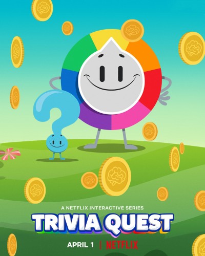
You can check out Netflix’s list of 11 shows based on video games here. This list features some of the most popular games, such as. Pokemon, Minecraft, Pac-Man and more. Netflix also offers interactive experiences like the special episodes of Black Mirror and Unbreakable Kimmy Schmidt, as well as all-interactive shows like Trivia Quest, which blur the lines between shows and games.
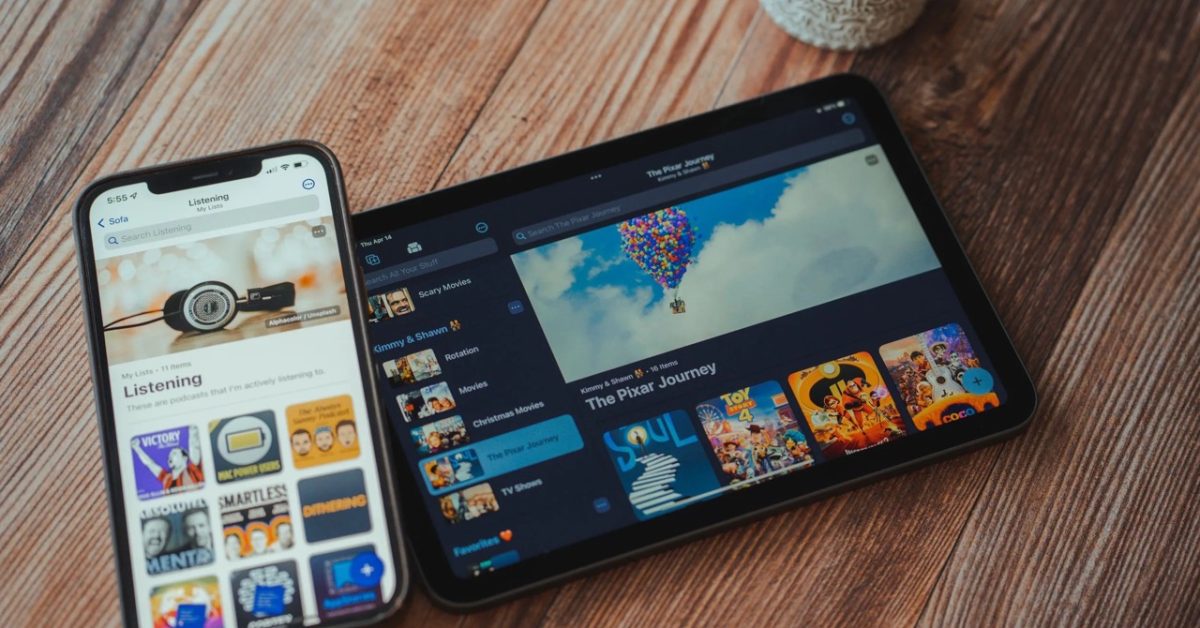
Beautiful iOS media organizer ‘Sofa’ makes lists more personal and fun with latest update
Sofa for iPhone and iPad is a wonderful app that offers one place to organize all the movies, TV, music, books, podcasts, apps, and games you’d like to check out. Sofa has five new features that make it easier and more enjoyable to customize lists.
Sofa 3. 3 is now available for iPhone and iPad with some valuable updates. Changes include the ability to add cover images to lists, the option to display large titles along with descriptions, and two new layout options.
You can also view the new edit list view and make custom settings to easily check your settings.
More changes with Sofa 3. 3 include the option to edit custom items, sticky notes markdown support, and eight new themes for spring and summer.
As I said last year when I reviewed Sofa, I recommend the app. It’s a free download with great features, a beautiful UI, and no ads. Super Sofa allows you to unlock all advanced features if it’s a good download. That runs $3. 99/month, $35. 99/year, or comes with a family subscription option at $5.99/month.
Sofa 3. 3 full release notes:
Hey gang, ready for a fun update? This release enables you to make your lists even more personal and fun.
* Cover images for lists
* Large titles and descriptions
* New layout options
* Custom settings per list
* Modify custom item title and image
REQUIREMENTS
* An iPhone or iPad running at least iOS 15+
* An Apple Silicon Mac running 12. 3+
******
**ABOUT THIS UPDATE**
The lists people make in Sofa are very personal. They are often meticulously planned and curated over time. A lot of time, effort, and care go into the creation and curation of people’s reading lists, watch lists, playing lists, and more. The benefit of Sofa is being able to manage all of this in one place so you can be more intentional with your downtime.
******
**WHAT’S NEW WITH LISTS**
For your lists, you’ll now be able to add a cover image, large title, and description, along with more layout options.
COVER IMAGES
Add a large cover image to each of your lists. You can search from Sofa’s movie, tv show, and video game data sources, Unsplash, or add an image with a URL.
LARGE TITLES & DESCRIPTIONS
Display large titles for your lists. Give it a description. For a more creative touch, descriptions can be written in markdown syntax. This is a great way to add bold, italic and links.
LAYOUT OPTIONS
Two brand new layouts for list and grid are now available. These “cozy” options are great for lists where you want a little more information density.
CUSTOM SETTINGS PER LIST
All list settings are now saved per list and synced with iCloud. This means you can choose different sorting and layout options for each list.
NEW “EDIT LIST” VIEW
To make it easy to understand all of these settings and adjust them as needed, you can use a brand new view. Tap the *** button in the top right of each list, then “Edit List Details”.
******
**EDIT CUSTOM ITEMS**
Custom items are an excellent way to add content and information to your lists, even though one of Sofa’s data sources isn’t able to find it. Previously, custom items would use a random image from Unsplash. You can now change your custom item’s title or cover image. You can now make your custom items more comfortable in your list.
******
**STICKY NOTES MARKDOWN SUPPORT**
Sticky notes now supports markdown syntax. This is helpful for adding emphasis and links to your notes.
IMPORTANT CHANGES
* Sticky Notes Editing requires that you tap the “edit” button at the top of the screen. There are pros and cons to this approach, but the main benefits are that rendering and interacting with Markdown is much more reliable with this implementation.
******
**NEW THEMES**
Sofa is ready for spring and summer with 8 new themes:
SPRING
* The New Day
* Flower Power
* Open Fields
* Sleeping Flowers
SUMMER
* Camp Out
* Clear Skies
* Surf’s Up
* Island Vibes
******
**IMPROVEMENTS**
* You can now take action on items when performing a global search
******
**BUG FIXES**
* Fixed the pluralization of an Activity metric category when the total equaled one.
* Fixed a bug where items would “flash” when being moved to and from the Shelf
******
Please don’t hesitate in reaching out to me with any feedback, questions, or suggestions. Feedback@sofahq.com is where I am most open to receiving feedback.
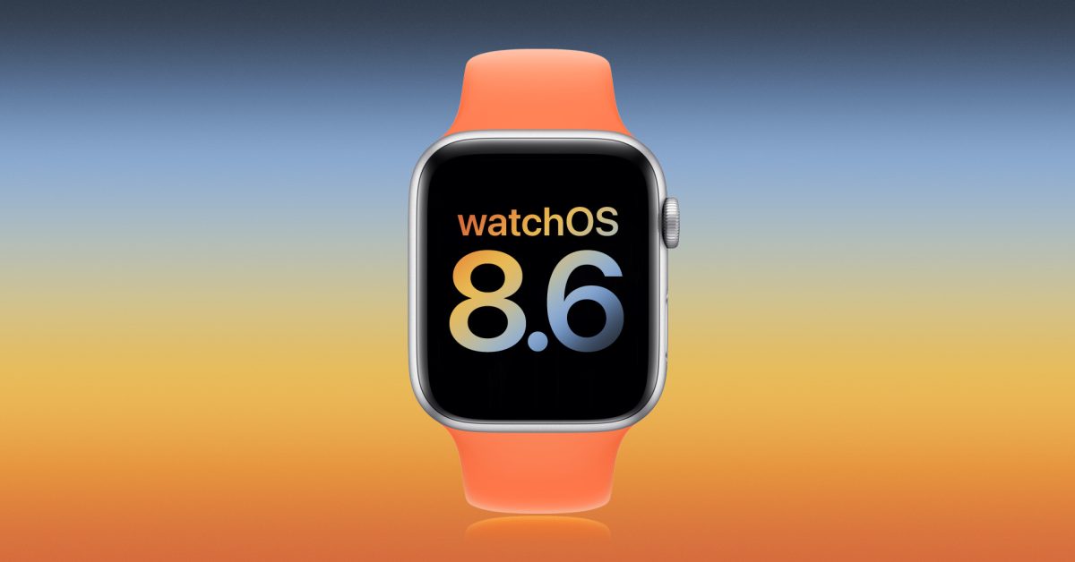
Apple releases watchOS 8. 6 beta 3 to developers and public testers
Update: A day after releasing watchOS 8. 6 beta 3 to developers, it’s now available to public beta testers as well .
A week after releasing watchOS 8. 6 beta 2 to developers, Apple is now seeding the third test version of the upcoming operating system for the Apple Watch. Here’s everything new coming with watchOS 8. 6 beta 3.
Today’s build is 19T5562f. Most of the news related to this version regards Apple Pay and Apple Wallet, which are the features also available with iOS 15. 5 beta 3. These are the :
updates
Physical Apple Card now called “Titanium Card” in Wallet settings
Apple Pay is rebranded to “Apple Cash”, in Messages app
iTunes Pass rebranded as “Apple Account Card” in the Wallet app
As analyzed by 9to5Mac, iTunes Pass will become a new card called the “Apple Account Card.” This card will be displayed in the Wallet app just like the Apple Card and the Apple Cash card. This way, instead of having to show a QR Code when shopping at an Apple Store, the user will be able to complete the purchase using Apple Pay.
Different from watchOS 8. 5, watchOS 8. 6 feels like a small update, since we are getting near WWDC 2022 keynote. The current version of the Apple Watch operating system offers a handful of new features, including 37 new emojis.
It also offers :
The ability to authorize Apple TV purchases and subscriptions;
COVID-19 vaccination cards in Apple Wallet, which now supports the EU Digital COVID Certificate format;
Updates to irregular rhythm notifications designed to improve atrial fibrillation identification (available in the United States, Chile, Hong Kong, South Africa, and many regions where the feature is available);
Audio hints in Fitness+ provide you with audio commentary of visually demonstrated moves during workouts.
watchOS 8. 6 beta 3 is available alongside the third beta version of iOS 15. 5, iPadOS 15. 5, tvOS 15. 5, and macOS 12. 4 .
If you spot any changes in the new betas from Apple today, let us know in the comments below or on .
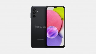
Time passes slowly for Samsung’s A0 series of phones, so you shouldn’t be surprised that speculative renders of the Galaxy A04s don’t look too much different from the previous model.
The dimensions given by @OnLeaks are 164. 5 x 76. 5 x 9. 18 mm, fractions of a millimeter larger than the A03s. However, the display is expected to stay at 6. 5″, probably still an HD+ panel.
Samsung Galaxy A04s (speculative renders)
The back does show a redesign. The back shows a redesign. We don’t know much about the individual modules, but there is still a triple-camera. There is no camera bump, however, only the lenses protrude from the back – just like on the Galaxy S22 Ultra. We don’t expect cameras any different from the Ultra.
Anyway, this is a basic phone that offers the basics – there is a 3. 5 mm headphone jack on the bottom, a fingerprint reader on the side (Power button) and what will probably be a SIM+microSD slot on the other side.
Samsung Galaxy A04s (speculative renders)
We’ll be on the lookout for specs for the Samsung Galaxy A04s. Here’s a quick look at the A03s, so you’d have an idea of what to expect: 6. 5″ HD+ LCD (60 Hz), Helio P35, 13+2+2 MP rear and 5 MP front cameras, 5,000 mAh battery with 15W charging. That one started at Rs11,500 ($155) in India when it launched, minus Rs2,000 for those that caught the early bird offer.
A look at the current Samsung Galaxy A03s
PS. if you go on the Pictures page in the Galaxy A03s, you can explore a 3D model of the phone. If you turn it right, the camera bump will stick out slightly at the back.
The Iron Oath might be the next great turn-based tactics game
The world of The Iron Oath is grim, full of bloodshed and betrayal. I am leading a company of mercenaries, seeking revenge after a mission went bad and a man I trusted left me to die. I have practical concerns to deal with, like maintaining my influx of gold and supplies. But I also have a much slower, more dreadful resource to manage: the passage of time, and with it, the terrible toll it takes on my mercenaries. I have already discovered the best way for me to adapt — being the worst person all the time.
The Iron Oath will be, in some ways, very familiar to fans of strategy games and RPGs. Take a little Darkest Dungeon , and add some XCOM. Finally, sprinkle some Divinity. Original Sin .. You can cook it in one pan. Add some beautiful pixel animations and an epic music score. Then add the imaginative demonic enemy designs and you have a delicious stew.
As I adventure around the fantasy realm of Caelum, I have to navigate between the open world, cities and towns, dungeons, and individual battles. It would be easy for these things to blur together into an indistinguishable mush of numbers and goals, but developer Curious Panda Games introduces each layer of complexity gradually throughout a well-paced tutorial and the early hours of the campaign. You can choose between a relaxing, easy-going adventure or a difficult trek through dangerous territory. The Iron Oath has both.
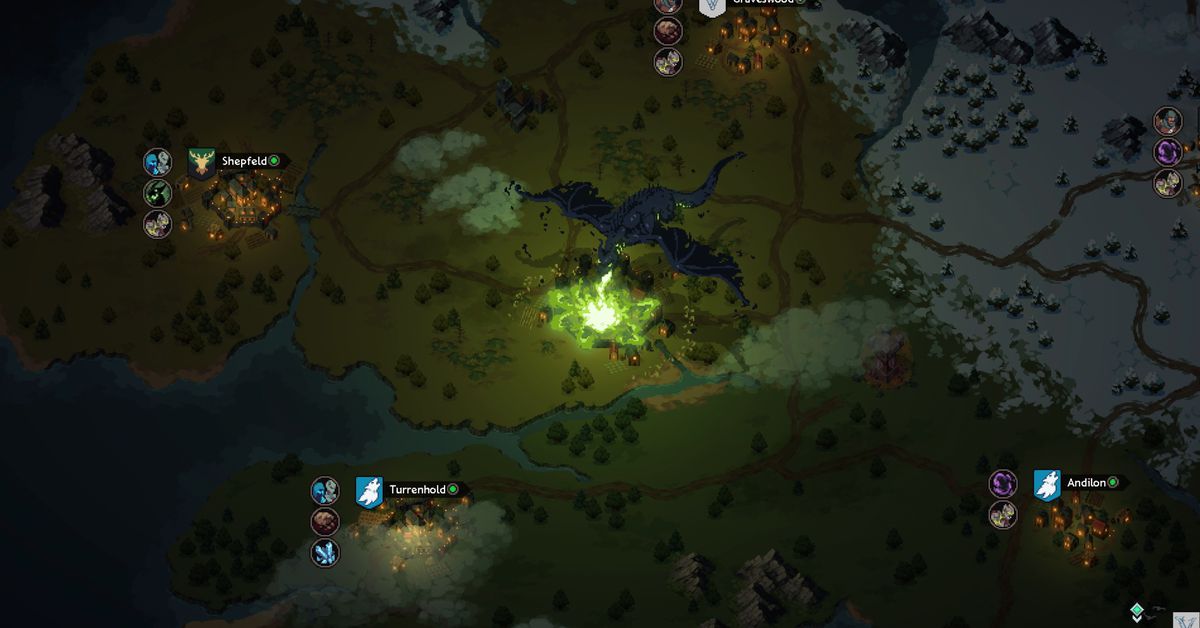
Image: Curious Panda Games/Humble Games
The game provides me with the tools I need to survive in this hostile world. My mercenaries include powerful rangers and warriors as well as elementalists and wizards. The feeling of unleashing an electric torrent against your enemy is incredibly satisfying. Or watching a valkyrie fly through the enemies spear first. After I had completed the intro, and was able to enter the world with my mercenary group, I felt confident I could catch the evil ne’er-do well who had stabbed me in back. I wanted to get my revenge.
Of course, it’s not always that easy. So my story evolved as I encountered other factions and explored new places, while expanding my business. Although this is an early access title, there are still plenty of good things. Players can upgrade and customize each mercenary in their party, and send their favorites out on more missions for XP. The drawback is that the more you lean on a select few mercenaries, the more stressed and injured they become. Relying too much on them might cause their to snap. Failure to address their injuries could cause them to die. This is just like Darkest Dungeon ,. It’s a tough gig. Although my company occasionally gets a round, they are more likely to be treated for skull fractures and trauma.
And even if you do everything “right,” the clock is ticking, as it is for us all. It isn’t like a Fire Emblem title in which everyone stays rosy-cheeked, bright-eyed. There are always new mercenaries to recruit, level up, and customize, and I can upgrade my company to make managing the crew easier … but as I juggle gold and potions, I learn to start treating human life with the same cold practicality. These aren’t my comrades — they’re investments.
Image: Curious Panda Games/Humble Games
This is particularly true during battles. The Iron Oath shines in this area. A dungeon gives me a clear overview. It is possible to scout out the area, find traps and then explore. When combat happens, we get right to business; my four mercenaries are placed on a grid along with some enemies. I then decide my initial placement, and the strategy begins. Cover, flanking and position are important. The enemy has powerful damage abilities and debuffs which can create chaos. If I do not plan for it, they will. My powerful spells and attacks also have limited charges for the duration of the dungeon, which means I have to ration across many battles.
This constant tension of resource management, limited supplies, and continual danger means that I sometimes have to make some rough choices — choices that my mercenaries will have thoughts about. In the darkest dungeons, I come across an injured man. While I could help the man, it would give my enemies time to create traps or ambushes. I can give him some of my precious medical supplies so he can escape on his own. You could also kill him and take his body. This might upset some of my mercenaries but it will be fine with others. Giving away health potions to strangers? In this economy?
Image: Curious Panda Games/Humble Games
If I make too many choices that my mercenaries don’t like (or if I don’t pay them because I just had to spend all of my gold on gear) they’ll leave the company altogether. An angry, exhausted mercenary can also be less effective in combat, leading to a downward spiral in morale, as their friends get hurt or die, and that could lead to a decrease in effectiveness.
The UI was my biggest problem during my time working with The Iron Oath . It’s a collection of little annoyances that don’t seem to matter individually, but they pile up over time. For instance, during battles, there’s no easy way to see my characters’ health at a glance as I survey the battle. The red shadow on their portraits is indicative of their HP loss. I also have the option to hover over the characters with my cursor and get full names and health bars. However, neither one of these options are very helpful when trying to find out the terrain and enemy information, as well as worrying about what happens to the rest of the dungeon. At other times, I accidentally closed out of upgrade screens, and it took me a while to find them again. None of these are deal breakers (especially in an early access game) but they’re bummers nonetheless.
Overall, I’m excited to see how The Iron Oath develops; Curious Panda Games has already laid out a road map throughout 2022 leading to an eventual full release that includes a new class, more points of interest, and more quests. For now, I’m having a lot of fun with the current build — my mercenaries, on the other hand, probably have some complaints with my management style.
The Iron Oath was released on April 19 on Windows PC. The game was reviewed using a download code provided by Humble Games. Vox Media has affiliate partnerships. These do not influence editorial content, though Vox Media may earn commissions for products purchased via affiliate links. You can find additional information about Polygon’s ethics policy here.
Apple adds pair of mixed reality headset patents to its portfolio as AR/VR product development continues
While Apple Glasses rumors continue to brew, it seems we may be getting closer to seeing an augmented reality/virtual reality (AR/VR) headset from the tech giant. According to Patently Apple, the U.S. Patent and Trademark Office has granted Apple two mixed reality (MR) headset patents.
A patent for a head-mounted device, (HMD), that has an infrared mirror finish is covered by The patent notes that headwear-like sunglasses or ski goggles often use protective coatings that create a one-way mirror effect. When the user wears one of these items, you won’t be able to see their eyes.
This patent is going to be for an HMD or something else that features a one-way mirror. “The infrared-transparent one-way mirror may be formed by a layer of material that is supported by head-mounted support structure or other support structure.”
Patently Apple goes on to state there will be multiple optical components of the Apple headset. It could be a visible-light camera, infrared emitting device or an infrared sensor.
While the headset allows the user to see the outside world around them, the one-way mirror finish at the front of the headset hides various cameras and gaze tracking systems. It is not visible to the public.
Apple’s other patent covers an HMD charging system. This would include a head-mounted display with a display unit, a power storage device, and receiving coils. The receiving coils could be for charging the headset.
Despite this, many don’t believe an Apple headset will ever come to fruition. There have been rumors going around for many years. It’s not hard to doubt them. However, Apple wouldn’t be the first tech company to make one. Meta has its Quest VR headsets and Snap has Spectacles. Why can’t an iPhone manufacturer create one?
Apple should make iOS 16 customization more like Android’s: Here’s what I want to see
Apple doesn’t offer truly individualized customization of its products or interfaces to its users, and if anyone wants to customize the look of their Apple products – specifically their home screens – they’re in for A Time. With iOS 16 coming in September, there’s an opportunity for Apple to give consumers needed autonomy.
The only cell phones I’ve ever owned have been a Nokia (shoutout to Snake, my first love), a Blackberry, and an iPhone, none of which I’ve ever fully customized.
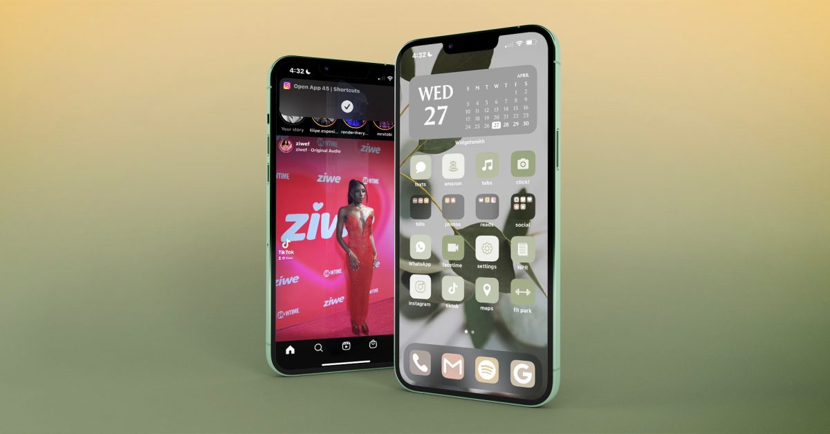
I am currently using my seventh iPhone and have always believed that the home screen of my smartphone is what it appears. Sure, I can “edit” the home screen’s layout with apps, widgets, and folders for organization, but I’ve never been able to make it more me – you know, how Android users can make their phones more them. That all changed this week when I tried my hand at customizing my phone’s home screen using two icon packs I purchased from Etsy.
Using this article (and its author Michael Potuck), as my guide, I gradually became more familiar with Widgetsmith and Shortcuts, along with everything else that’s required to make a customized home screen on my iPhone. Here’s what I had to do – which I will never do again because it took far too long.
Own an icon pack
First of all, the sheer number of icon packs available online is overwhelming. Although it is fun to look through the options online, I soon lost interest. It was almost like shopping in a mall instead of a boutique owned by an independent business.
You can find free icon packs, grab icon packs from Etsy, or create your own icon pack (though I hear this is difficult), and there are, quite literally, tens of thousands of packs to choose from. I spent about five minutes online before deciding on this icon pack for $6, and I got to work.
Download multiple zip files and PDFs
This was the first step that caused problems, even though it seemed like it was a small one. Following the instructions of the Etsy seller I downloaded zip files and pdfs. Once they were on my desktop, I needed to open them. Then, I had the task to open the zip file folders. It was tedious. Once I had access to the icon and widget folders, I, of course, had to choose which icons and widgets I wanted out of the hundreds available in the icon pack – I genuinely had no idea how bad it would get.
Copy and paste icons into Photos
I didn’t anticipate this step being so laborious, but wow was it ever. You have to cross-reference the apps you already have on your phone with the matching icons from the downloaded zip folders, and then you have to copy and paste those icons into Photos. Make sure you have iCloud syncing on, or you won’t be able to access the icons you chose on your phone.
Use shortcuts to redesign apps
Enter: the absolute epicenter of my frustration with Apple home screen customization.
Never have I ever become so familiarized with an app in the way I have become with Shortcuts during this process, and I am certain that I’ve barely scratched the surface of everything Shortcuts can actually do.
I don’t know where to start.
Basically, I had to open Shortcuts, hit the + sign in the upper right-hand corner, tap “Add Action,” type “open app” in the search bar, then tap “Open App” under “Scripting,” THEN choose from a list of apps I have on my phone in order to customize one of them.
Let’s suppose I want to personalize the Instagram app.
After I selected Instagram, I needed to click the three blue dots in the upper left corner. I chose “Add to My Home Screen,” renamed the app and then picked the photo from iCloud that would accompany it. Finally, I clicked “Add.” Honestly, this is all far too much as I’m reliving it, and I hate that I feel so compelled to write about it, but here we are.
At this stage, the app was in my hands using the icon packs I bought, which I copied into Photos and then redesigned in Shortcuts as I wished. I then had to repeat the re-design via Shortcuts with every app I wanted on my home screen, which took me no less than two hours. Now, the fun part?
Aesthetics over everything
If you are like me, and like things to be even and aligned, this step of personalizing your home screen can take many hours. You have your re-designed apps-turned-shortcuts! These are the correct color palettes (you believe). You’ve renamed each app in all lowercase (with the exception of WhatsApp) for reasons you can’t eloquently explain!
Even if your home is not as cluttered and crowded as mine, it can take you hours to decide how you will use the space. An important note here, which takes additional time: When arranging your home screen, you need to long-press the original apps to “Remove from Home Screen” to alleviate clutter and make room for your shortcuts, while being careful to not actually delete the original app – otherwise your shortcuts won’t work.
The finished product. “She’s a beaut,” my colleague Allison appreciatively noted
I genuinely love how my phone now looks after an entire morning of customizing my home screen, but there are still issues.
The gray widget calendar at the top, for example, doesn’t actually sync to my iCal, but rather, opens the app Widgetsmith – something I had to download to create that particular widget in the first place; there is no workaround for this, lest I download a third-party calendar app, which I am certainly not. This means that I either have to swipe right on my home screen to access my actual calendar or search for it in the pull-down menu. Kyle, my Android-user coworker, was shocked when I brought up this issue to him.
Additionally, every time I open any of my newly-created, earthy apps (re: Shortcuts), I see this little swoopdy-woop that comes and goes – which can be dismissed with a swipe – but will appear every time I open a shortcut, forever, in perpetuity:
Ziwe Fumudoh looking stunning, along with a reminder from my phone that I am, in fact, using a shortcut I created.
Last but not least, now that I’ve re-designed all of my apps to look exactly how I want them to with the help of my icon pack on my home screen, I am left with a clutter of icons, widgets, and wallpapers in my photo album(s) in addition to zip files and folders on my desktop that now need to be cleaned up.
iOS 16 to the rescue?
After chatting with some of my colleagues over at 9to5Google, I learned some things that Apple’s forthcoming iOS 16 could do to improve this process.
To start, iOS 16 could simply include any available themes for our home screens, let alone customizable ones. Did you know that what took me four hours would take someone about a minute and a half on an Android? I’ve seen a video of it being done. Android users have loads of built-in themes to choose from, and that barely scratches the surface.
More specifically, did you know that when you pick a color theme on an Android for your home screen, apps that are native to the phone automatically update to that specific color palette? Imagine not having to individually create and customize each and every one of your apps into a shortcut, whether or not they’re from a third party. If iOS 16 at the very least allowed us to customize native apps and widgets with pre-chosen themes, that would be a huge step in the right direction.
Final thoughts
I want to say here for the record, that on a scale of tech-savviness – 10 being extremely tech-savvy, and 1 being not at all – I’m like…a 7, probably, at least in comparison to your average person (not in comparison to literally any of my coworkers). Despite my knowledge and understanding of very particular technology, the process was extremely difficult. From start to finish, it took me approximately four hours to create my home screen design.
What did Apple do? They kept us loyal, and, for the most part, wildly loyal, customers who could customize their own Apple devices. Now that I’ve seen what my home screen can look like – while also understanding on a level that I wish I didn’t – what it takes to get a home screen that you love, I want everyone to have icons, widgets, and themes that reflect their personality. Why does Apple refuse to give us any autonomy as consumers?
As I was lamenting to my coworkers at 9to5Google about my customization ordeal, Ben Schoon said, rather joyously, “Come to Android – it’s so much easier ..” I won’t, again for reasons I can’t explain, but that’s not the point.
The point is this: for Apple to gatekeep customization from its user base is, at this stage, an antiquated, frustrating, and frankly outlandish approach for a company that touts creativity, inspiration, and innovation in each of its individual products. If I want to be inspired by my device, to be creative with my device, to innovate on my device, why can’t I make it my own?


:format(webp):no_upscale()/cdn.vox-cdn.com/uploads/chorus_asset/file/23420249/ss_f0e7aa192fdd913c9c95c8bea7cb9f7ba74eafcd.jpg)
:format(webp):no_upscale()/cdn.vox-cdn.com/uploads/chorus_asset/file/23420252/ss_7588f249ebd8147ca4cc729ced465f02cabb0311.jpg)
:format(webp):no_upscale()/cdn.vox-cdn.com/uploads/chorus_asset/file/23420257/ss_05a9e185accad5db3f2389304adbd0f0b035000f.jpg)